Tools
Figma ∙ Whimsical ∙ Elementor Pro
Industry
Creative Business
Timeline
6 Weeks
Web Design · Development · Wordpress
A conversion-focused website for a broadcast-quality video production company.
Tools
Figma ∙ Whimsical ∙ Elementor Pro
Industry
Creative Business
Timeline
6 Weeks
01.
Media Monty is a video production company specialising in interviews, documentary storytelling, and purposeful content. This project involved crafting a digital platform that showcased their portfolio, streamlined client engagement, and drove new business opportunities.
Potential clients needed to see the calibre of the work; and know exactly how to take the next step.
03.
A potential client landing on the Media Monty website needs to quickly understand what the company does, trust the quality of the work, and know how to take the next step. The platform also needed to serve returning clients, making it easy for them to access information and engage with the team.
05.
The site needed to reflect the quality of Media Monty's work while making it effortless for potential clients to take the next step. Every decision was made with both in mind.
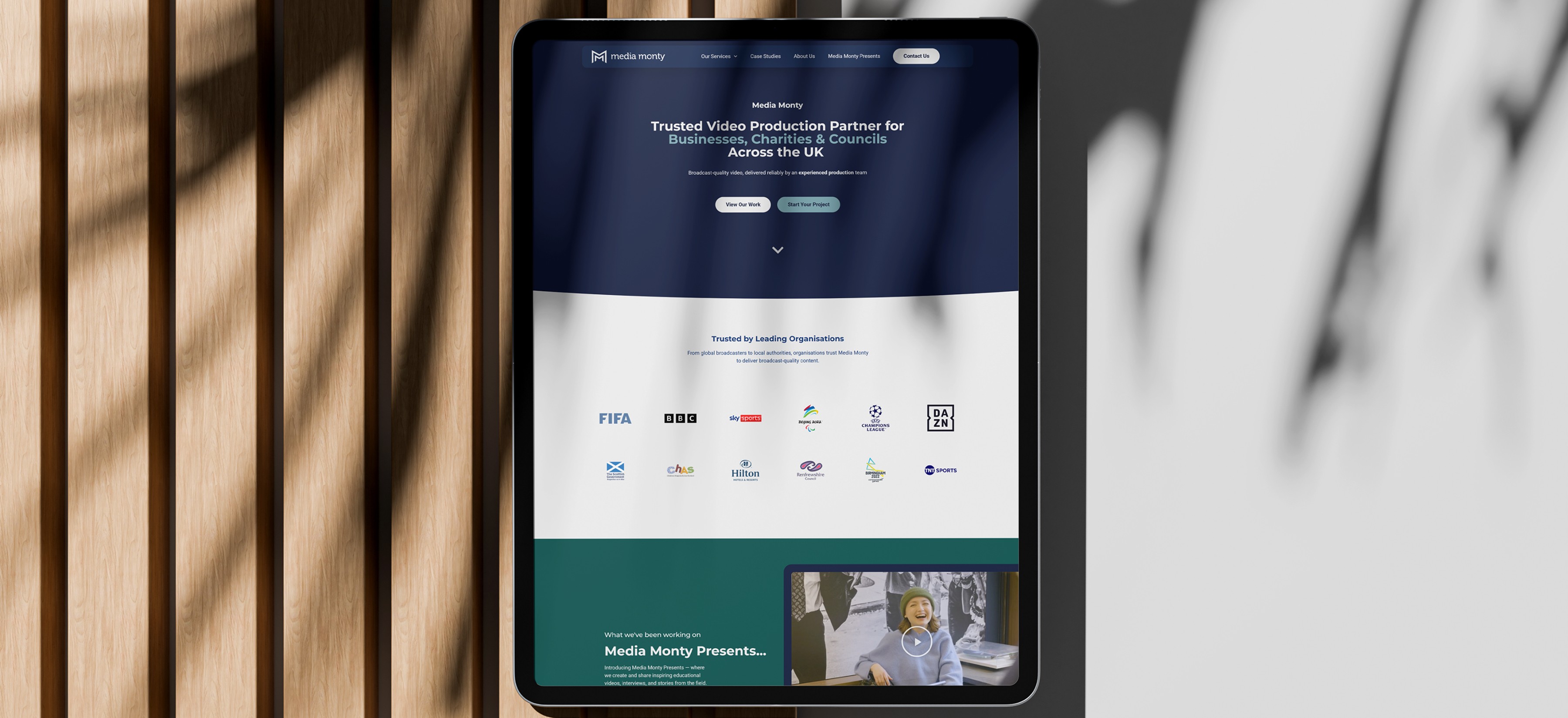
The hero leads with a bold, conversion-focused headline and two clear CTAs: one to view the work, one to start a project.
The hero sets the tone for everything that follows. The language was written with conversion and SEO in mind: clear, direct and keyword-rich, so the site works for visitors arriving organically and those referred directly.
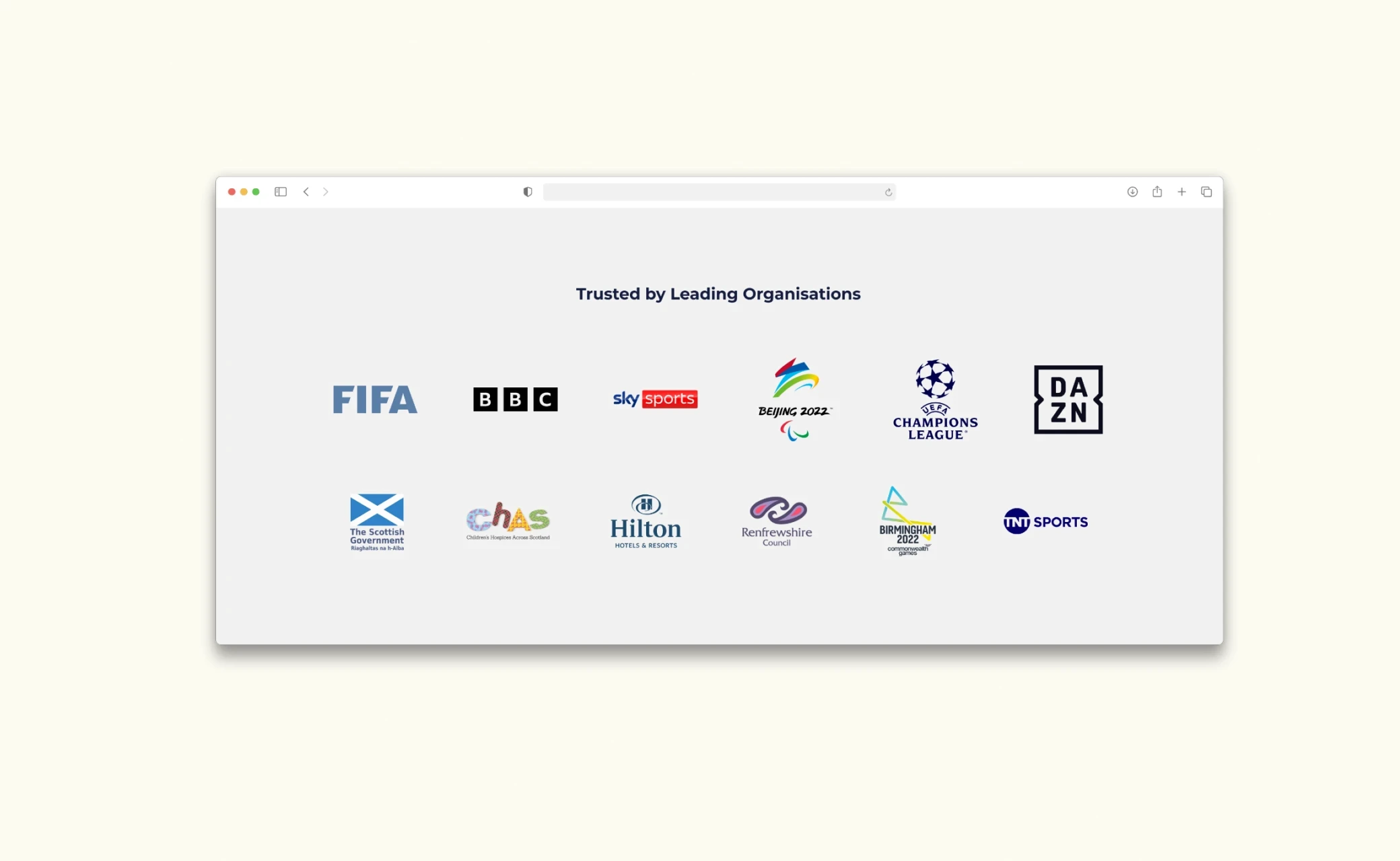
A client logo strip placed early on the homepage, featuring recognisable names from across Media Monty's portfolio.
For a video production company, the names behind the work carry as much weight as the work itself. Recognisable logos build immediate credibility and signal the calibre of clients Media Monty works with; before a visitor has even scrolled to the services.
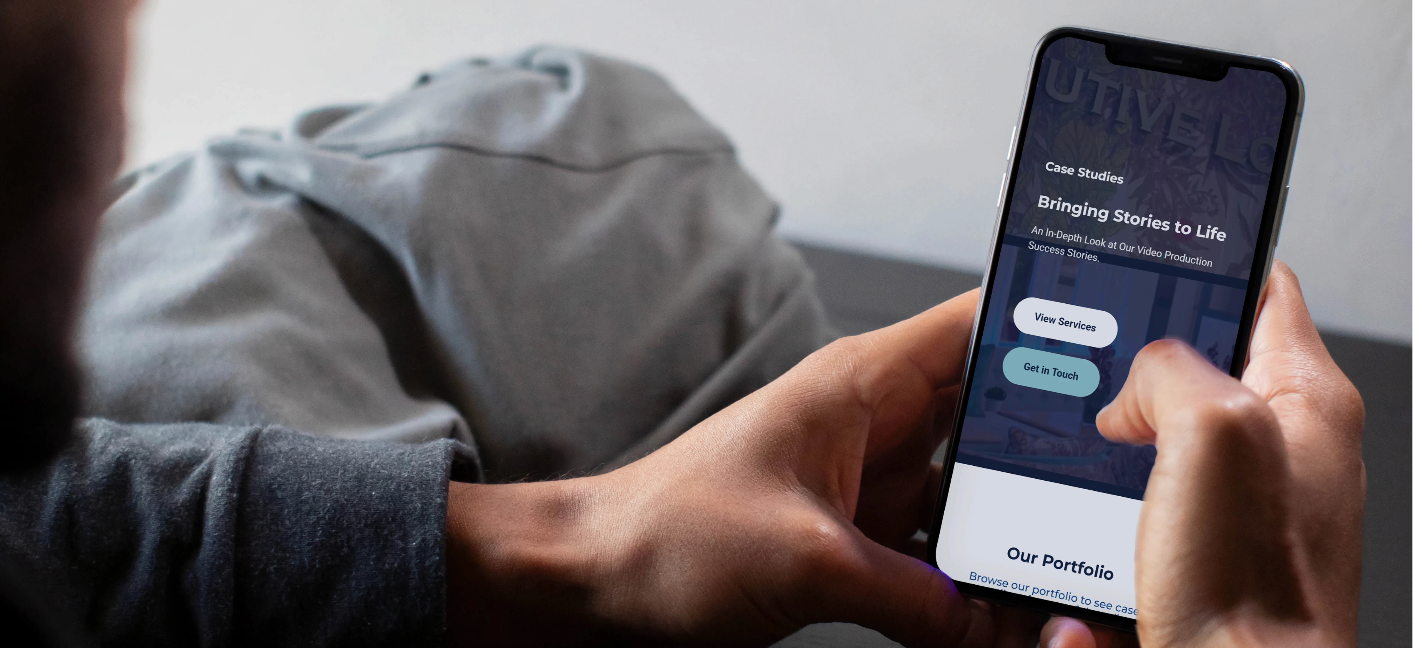
A dedicated homepage section introducing Media Monty Presents as a new standalone service, anchored by the first published interview embedded directly on the page.
Launching a new service needs more than a menu link. Featuring it on the homepage with a real video does two things at once: introduces the service and immediately demonstrates the quality of the output.
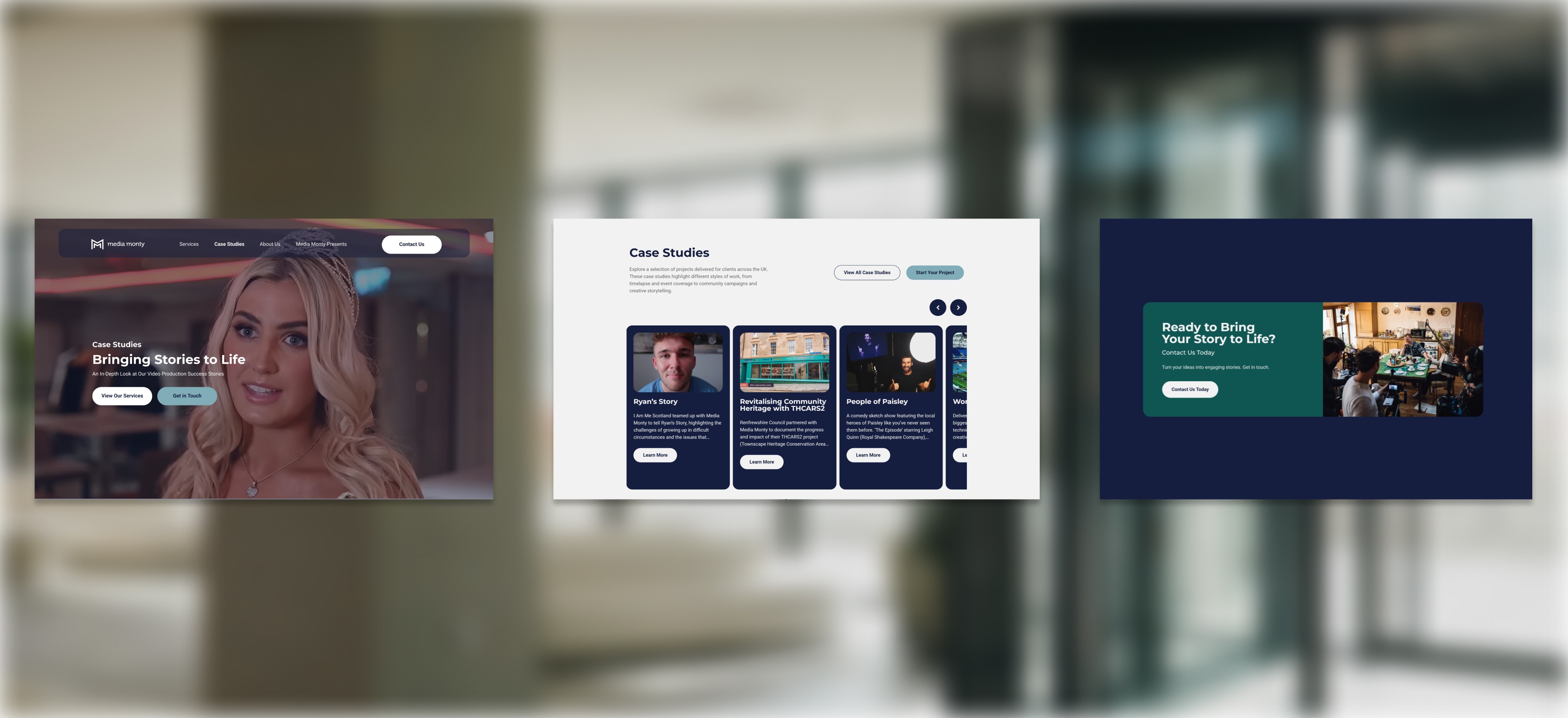
Services are presented in a bento-style card grid: varied sizes, image-led, with alternating navy and teal backgrounds. Each card links to a dedicated service page.
A grid of image-led cards reflects the visual nature of the industry while keeping the layout modern and scannable. The bento format creates natural hierarchy: drawing the eye to featured services without overwhelming the visitor.
Each service page includes three clearly structured pricing tiers: name, price, what's included, add-ons and a direct Book Now CTA.
Pricing transparency removes one of the biggest barriers to contact. Structured tiers help clients self-select the right package and arrive at the conversation already informed: reducing friction and improving conversion.
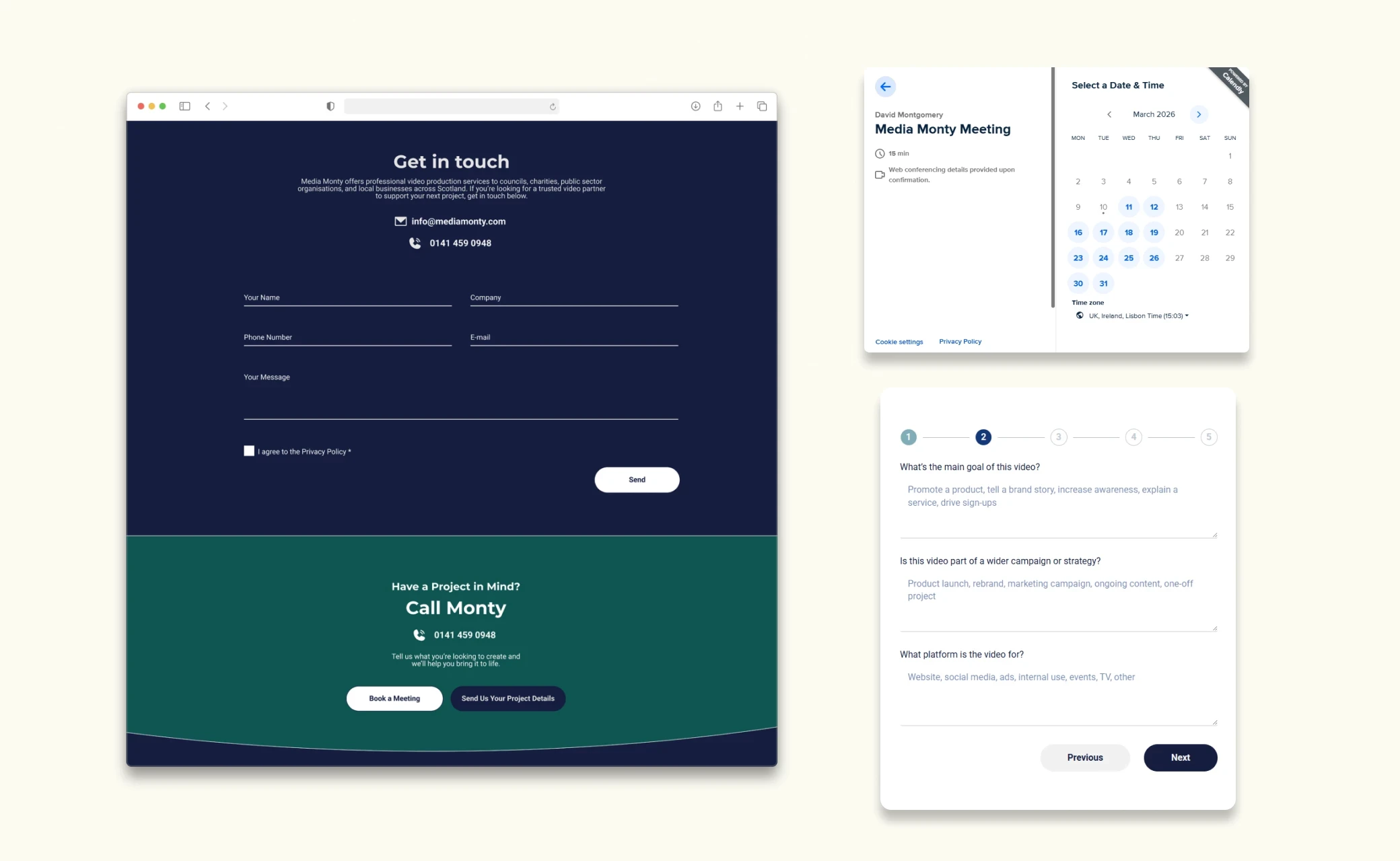
The contact page offers three options: a simple form for early-stage enquiries, a multi-step project form for clients with a brief ready, and a Calendly button for direct meeting booking.
A single contact form puts the burden on the visitor to figure out what to say. Separating the options removes that friction: a simple form for those still figuring it out, a detailed project form for those ready to brief, and a direct booking for those who just want to talk.
06.

07.


06.
Midnight
Primary - 60%
CONFIDENT ∙ HONEST
#151E3F
A clean, editorial layout with alternating full-width imagery and text sections creates a natural reading flow for every case study.
The embedded video at the results stage lands at the moment a potential client is most convinced, turning the page into a direct demonstration of the work rather than a description of it.

08.