CASE STUDY

La Consentida

Website Audit & Redesign

Heuristic Review · Branding · Web Design

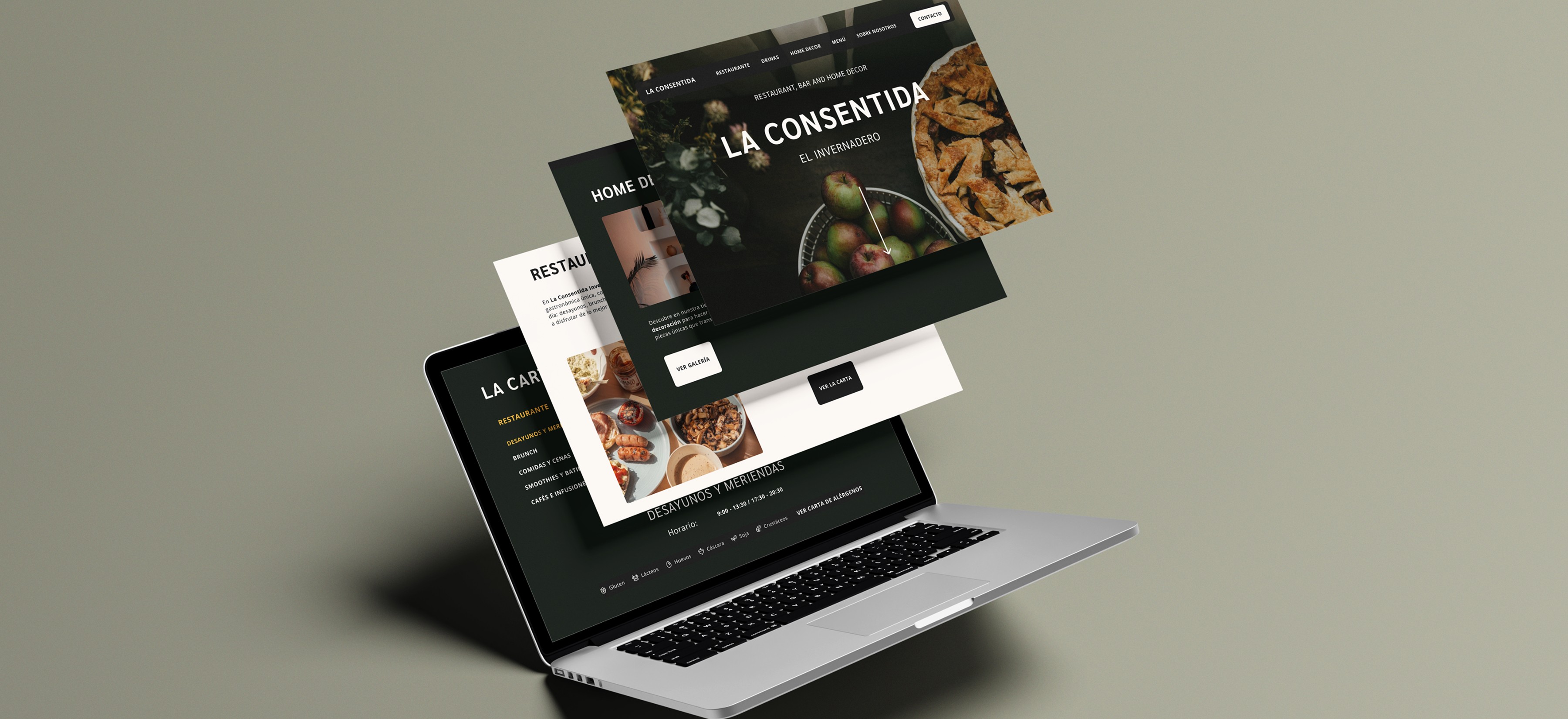
Redesigned the website for La Consentida, a restaurant, bar, and home décor boutique in León, Spain.

Tools

Figma ∙ Notion

Industry

Hospitality / Retail

Timeline

3 Weeks

01.

PROJECT OVERVIEW

A space with a lot of personality, but a website that communicated none of it.

La Consentida is a local restaurant and concept store combining food, decor and curated products. The redesign focused on one clear goal: replacing a frustrating, untrustworthy website with one that reflects the warmth of the brand behind it.

The navigation didn't behave the way users expected, essential information was hard to find, and nothing on the homepage explained what the place actually was.

La Consentida’s website required a modern update, but the issue extended beyond aesthetics. Users were required to search for essential details such as opening hours, contact information and menu categories. The experience lacked structural clarity and predictable interaction patterns.

02.

02.

02.

PROBLEM IDENTIFICATION

PROBLEM IDENTIFICATION

03.

ORIGINAL DESIGN

The design felt dated and unstructured.

Visually inconsistent, with no clear sense of hierarchy or brand presence. For a first-time visitor, it was difficult to get a feel for the place, navigate with confidence, or find the information they came for. It was a collection of small frictions that added up to a frustrating experience.

Original Homepage
Original Navigation Menu / Food Menu
Original Food Menu
HEURISTIC REVIEW ☆ HEURISTIC REVIEW ☆ HEURISTIC REVIEW ☆

04.

UX AUDIT

To objectively evaluate the experience, I conducted a heuristic audit using Nielsen's 10 usability principles, identifying usability issues and prioritising them by severity (0–4). This allowed decisions to be grounded in structured evaluation.

To objectively evaluate the experience, I conducted a heuristic audit using Nielsen's 10 usability principles, identifying usability issues and prioritising them by severity (0–4). This allowed decisions to be grounded in structured evaluation.

To objectively evaluate the experience, I conducted a heuristic audit using Nielsen's 10 usability principles, identifying usability issues and prioritising them by severity (0–4). This allowed decisions to be grounded in structured evaluation.

0 - Not an issue
1 - Fix if time allows
2 - MINOR
3 - MAJOR
4 - CRITICAL
Critical Issues

Heuristic 4: Consistency and Standards

Menu icon opens food menu

Menu icon opens food menu

Menu icon opens food menu

Expected: site navigation.
Got: food menu.
Breaks one of the most established conventions in web design.

Expected: site navigation.
Got: food menu.
Breaks one of the most established conventions in web design.

Expected: site navigation.
Got: food menu.
Breaks one of the most established conventions in web design.

Heuristic 2: Match Between System and the Real World

Heuristic 2: Match Between System and the Real World

Heuristic 2: Match Between System and the Real World

Allergen labelling uses numbers, not icons

Allergen labelling uses numbers, not icons

Allergen labelling uses numbers, not icons

Allergens listed as numbers require users to scroll to a legend. For users with food allergies, this is a safety concern, not just a usability one.

Allergens listed as numbers require users to scroll to a legend. For users with food allergies, this is a safety concern, not just a usability one.

Allergens listed as numbers require users to scroll to a legend. For users with food allergies, this is a safety concern, not just a usability one.

Heuristic 9:
Help Users Recover from Errors

Heuristic 9:
Help Users Recover from Errors

Heuristic 9:
Help Users Recover from Errors

Blank 404 page

Blank 404 page

Blank 404 page

No message, no explanation, no way back. Users can't tell if the site is broken or the page just doesn't exist.

No message, no explanation, no way back. Users can't tell if the site is broken or the page just doesn't exist.

No message, no explanation, no way back. Users can't tell if the site is broken or the page just doesn't exist.

MAJOR ISSUES

Heuristic 3: User Control and Freedom

Heuristic 3: User Control and Freedom

Heuristic 3: User Control and Freedom

No back button on food menu

No back button on food menu

No back button on food menu

The only exit is reopening the nav or going back to the homepage. No natural way to move through the content.

The only exit is reopening the nav or going back to the homepage. No natural way to move through the content.

The only exit is reopening the nav or going back to the homepage. No natural way to move through the content.

Heuristic 5: Error Prevention

Heuristic 5: Error Prevention

Heuristic 5: Error Prevention

Broken links in navigation

Broken links in navigation

Broken links in navigation

Sections like "Breakfast & Dinner" look clickable but lead nowhere, eroding trust immediately.

Sections like "Breakfast & Dinner" look clickable but lead nowhere, eroding trust immediately.

Sections like "Breakfast & Dinner" look clickable but lead nowhere, eroding trust immediately.

Heuristic 6:
Recognition Rather Than Recall.

Heuristic 6:
Recognition Rather Than Recall.

Heuristic 6:
Recognition Rather Than Recall.

Opening hours and contact info hidden

Opening hours and contact info hidden

Opening hours and contact info hidden

Essential information was buried inside the navigation menu rather than visible on the page.

Essential information was buried inside the navigation menu rather than visible on the page.

Essential information was buried inside the navigation menu rather than visible on the page.

Minor Issues

Heuristic 1: Visibility of System Status

Heuristic 1: Visibility of System Status

Heuristic 1: Visibility of System Status

No location indicator while browsing

No location indicator while browsing

No location indicator while browsing

No breadcrumbs, no active state. Users lose track of where they are within the site.

No breadcrumbs, no active state. Users lose track of where they are within the site.

No breadcrumbs, no active state. Users lose track of where they are within the site.

Heuristic 8:
Aesthetic and Minimalist Design

Heuristic 8:
Aesthetic and Minimalist Design

Heuristic 8:
Aesthetic and Minimalist Design

Poor visual hierarchy

Poor visual hierarchy

Poor visual hierarchy

Everything competed for attention equally, no clear typographic structure to guide the eye.

Everything competed for attention equally, no clear typographic structure to guide the eye.

Everything competed for attention equally, no clear typographic structure to guide the eye.

Heuristic 10: Help and Documentation

Heuristic 10: Help and Documentation

Heuristic 10: Help and Documentation

No FAQ or help section

No FAQ or help section

No FAQ or help section

No dedicated place for users to find answers to common questions.

No dedicated place for users to find answers to common questions.

No dedicated place for users to find answers to common questions.

A summary of the key findings.

The full heuristic review is available to download at the end of this case study.

A summary of the key findings.

The full heuristic review is available to download at the end of this case study.

A summary of the key findings.

The full heuristic review is available to download at the end of this case study.

05.

DESIGN DECISIONS

Rebuilding the Experience

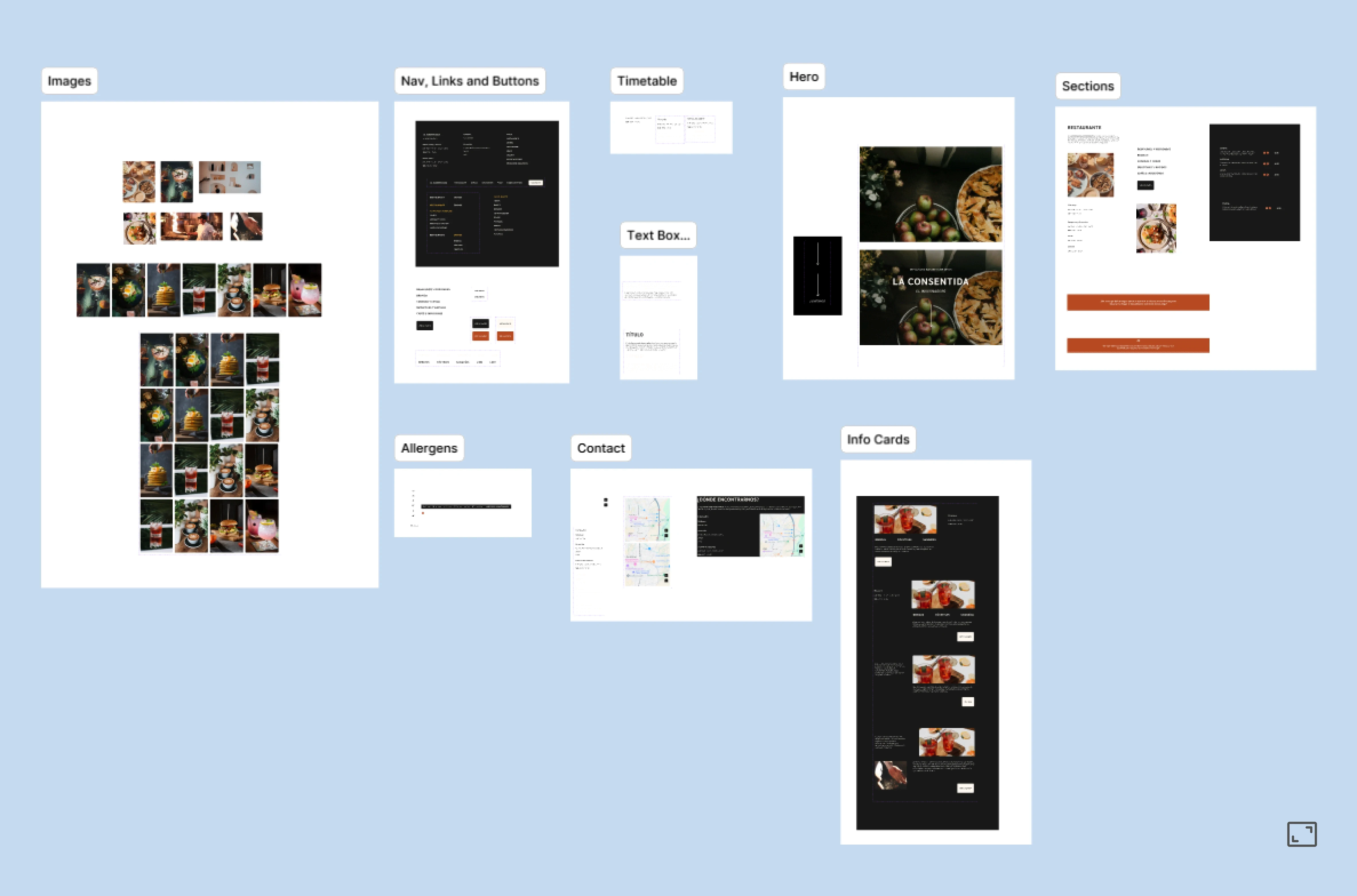
The audit pointed to six clear areas where the experience was breaking down. Each one became a design decision grounded in the findings, focused on the user.

Redesigning the Navigation

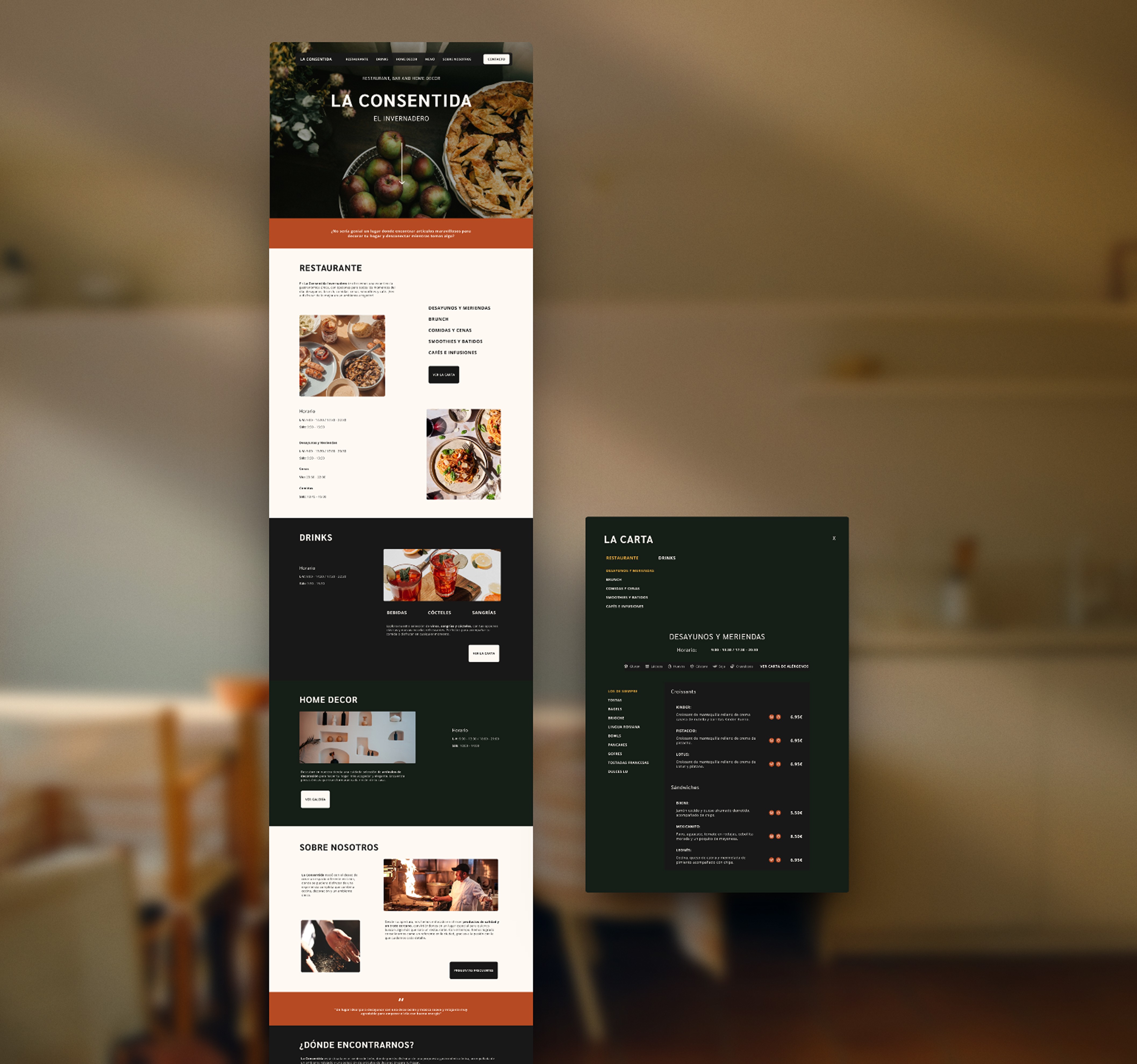
The menu icon was replaced for a navigation bar to work as standard site navigation, with the food menu accessible from within it.

WHY

A visible navigation bar removes any ambiguity. Users can see exactly where they can go without having to open anything first.

01

Improve Visual Hierarchy

Typography, spacing and colour were used to establish a clear order of importance, guiding the eye through the content naturally.

WHY

When everything looks the same weight, nothing stands out. Visual hierarchy gives users a clear path through the page.

02

Refining the Hero Section

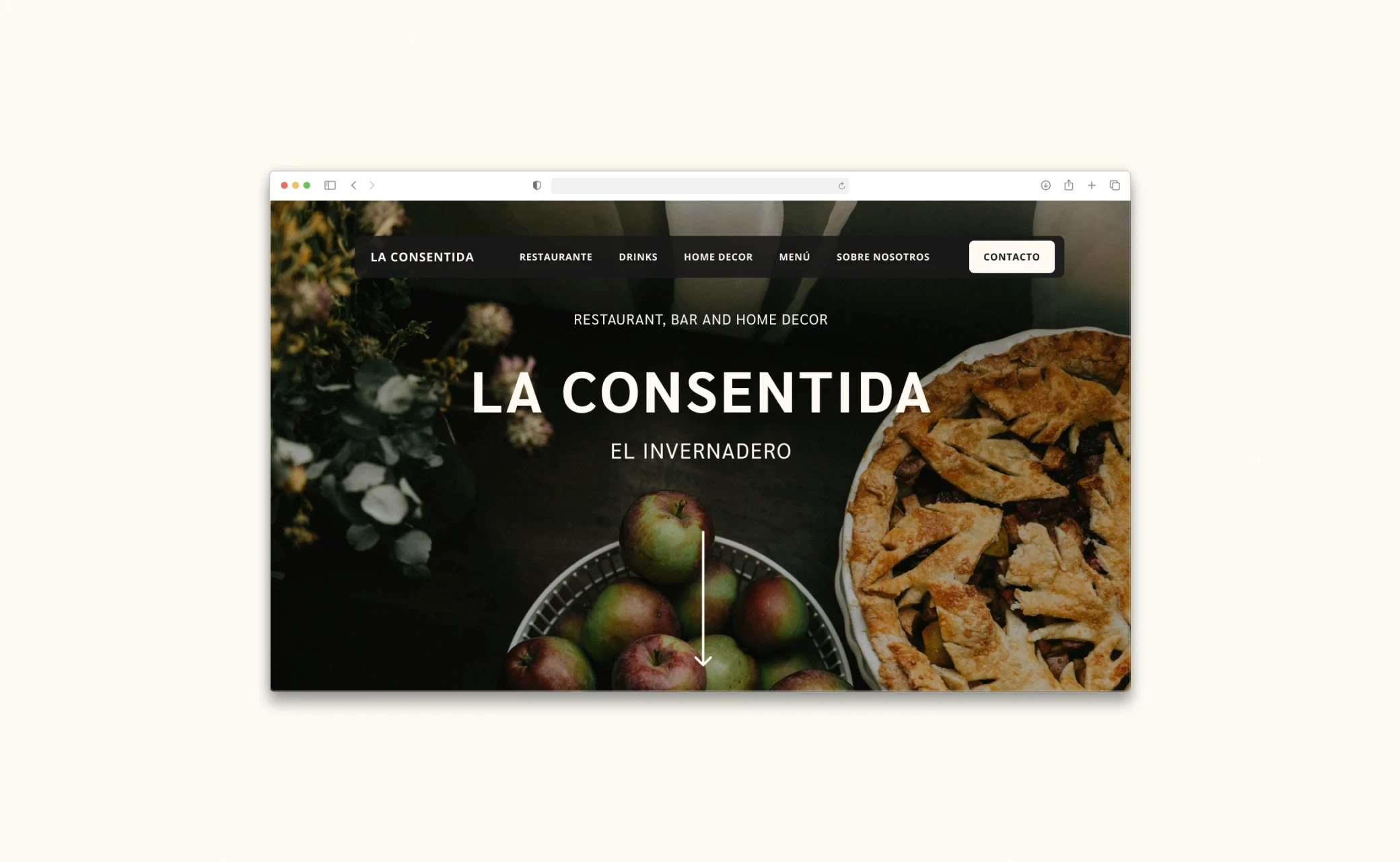
The hero section was rebuilt to introduce the brand clearly and guide users toward relevant content from the first scroll.

WHY

A homepage has one job: make the visitor want to stay. The redesign gives them a reason to.

03

Active States and Wayfinding

Active states were introduced across the navigation so users always know which section they're in while browsing.

WHY

Without a visual indicator, it's easy to lose track of where you are, especially when browsing a page with multiple categories.

04

Reorganising Key Information

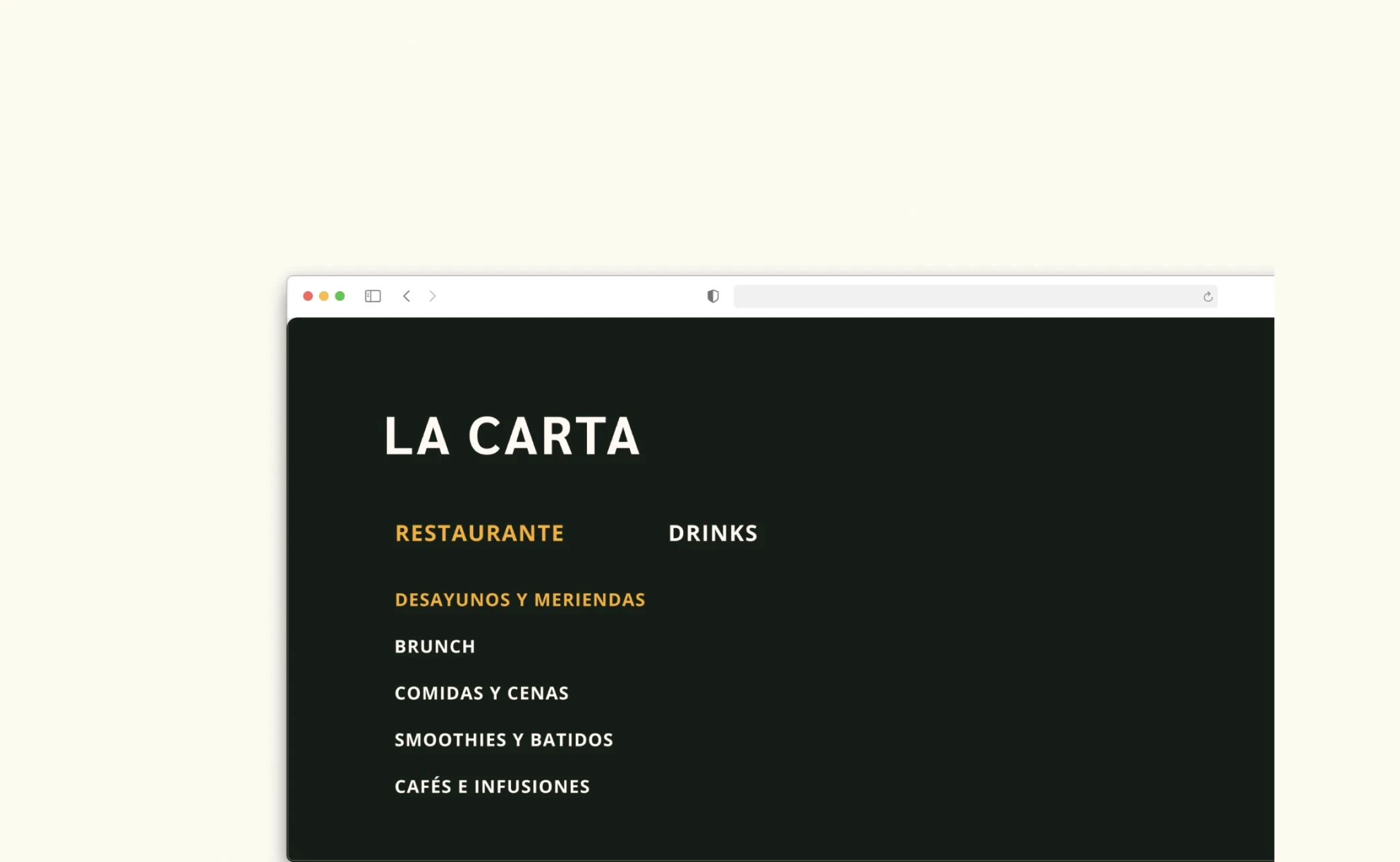
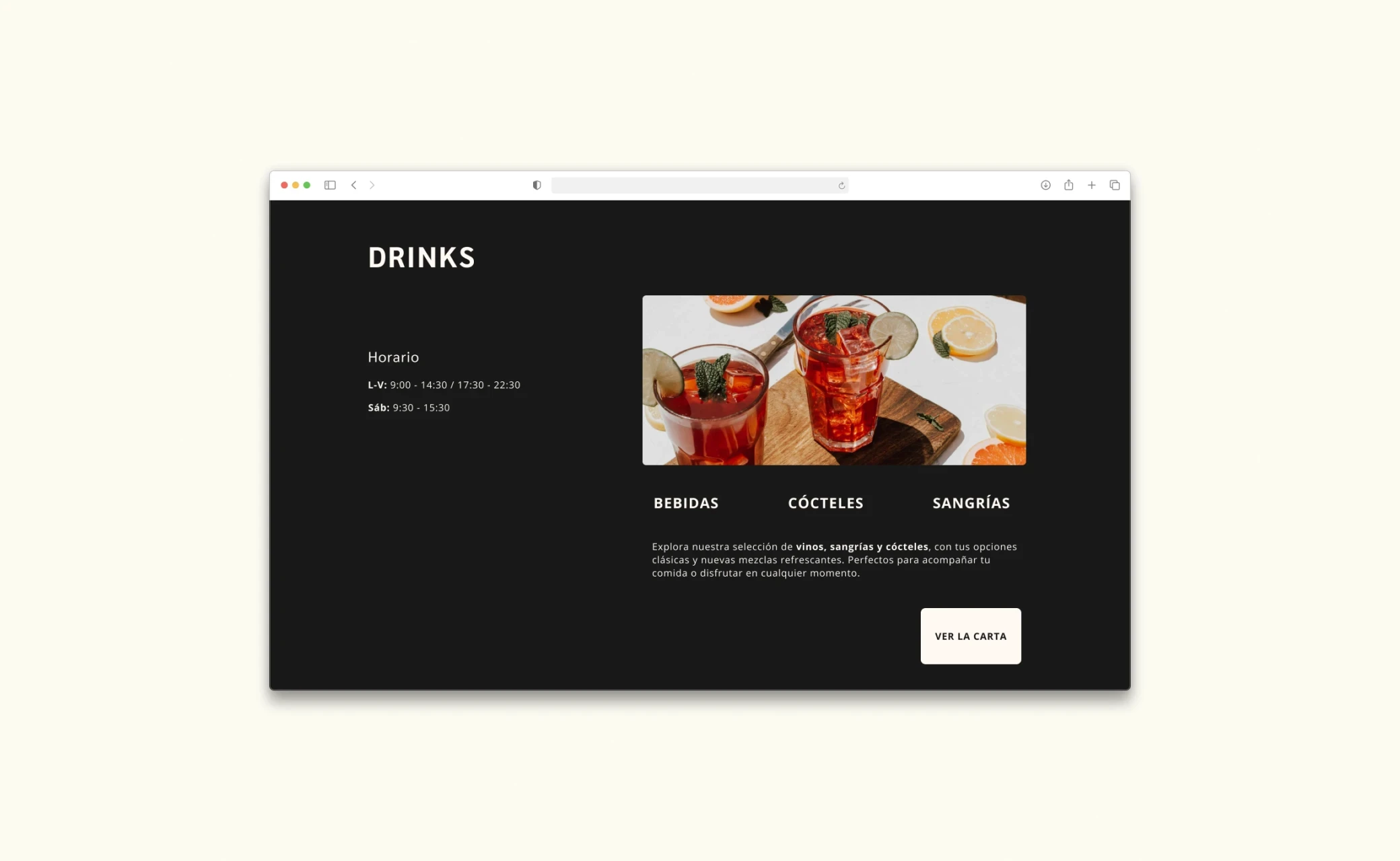
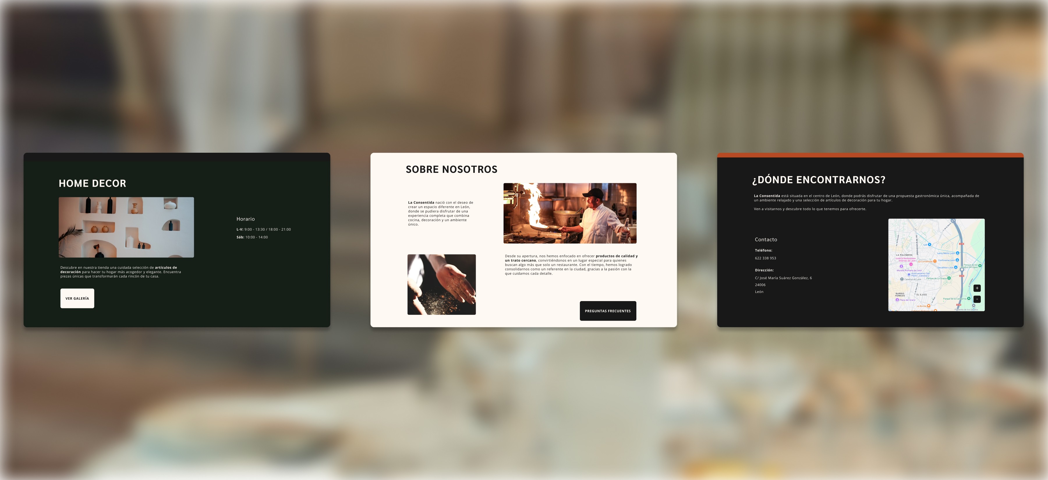
A card sorting exercise was used to restructure the site's content into clear, logical groupings, giving each offering its own dedicated section.

WHY

Users shouldn't have to piece together what a business offers. Dedicated sections reduce cognitive load: each space has its own context, so the information is where users expect it to be.

05

Enhancing Allergen Labelling

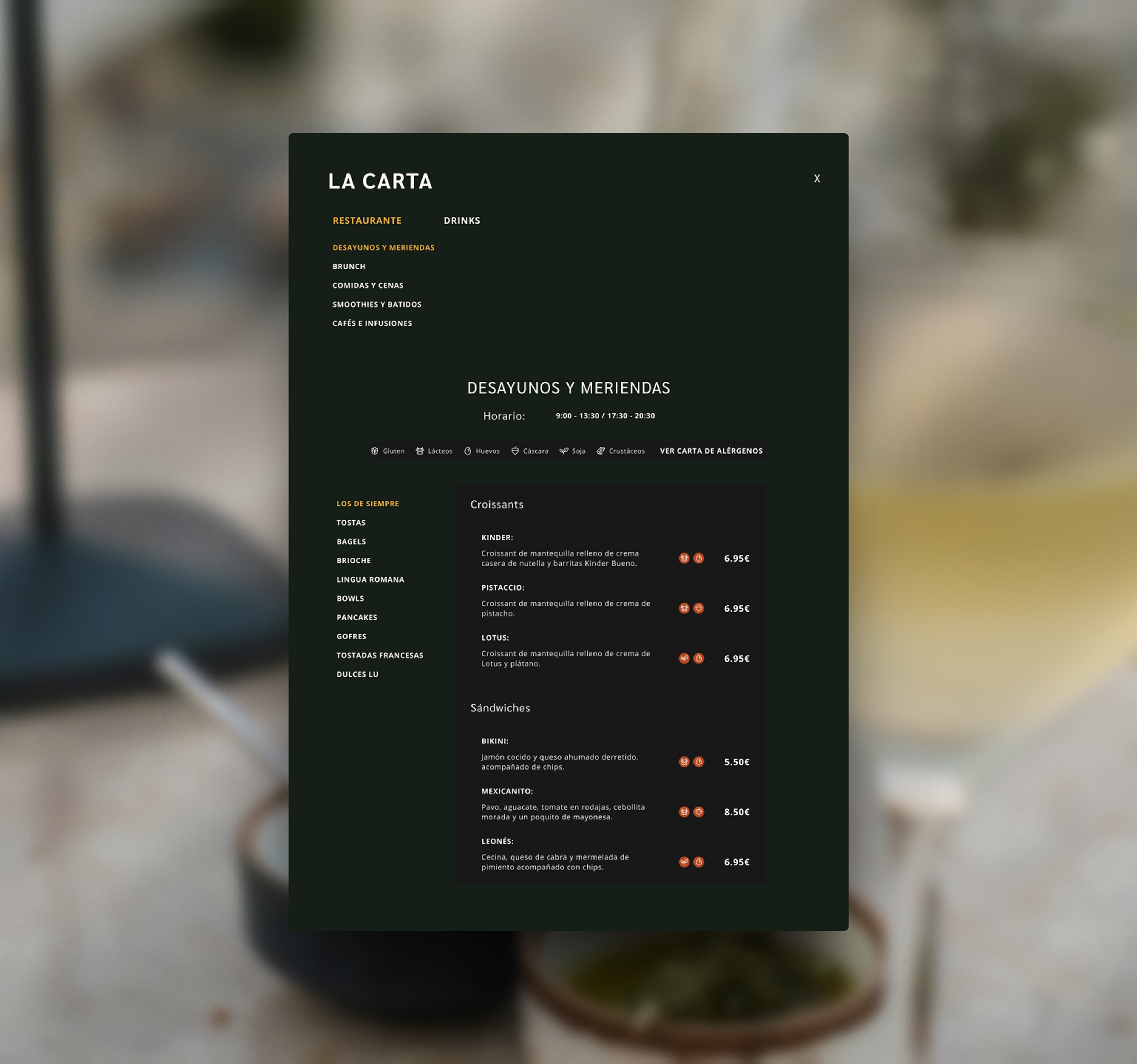
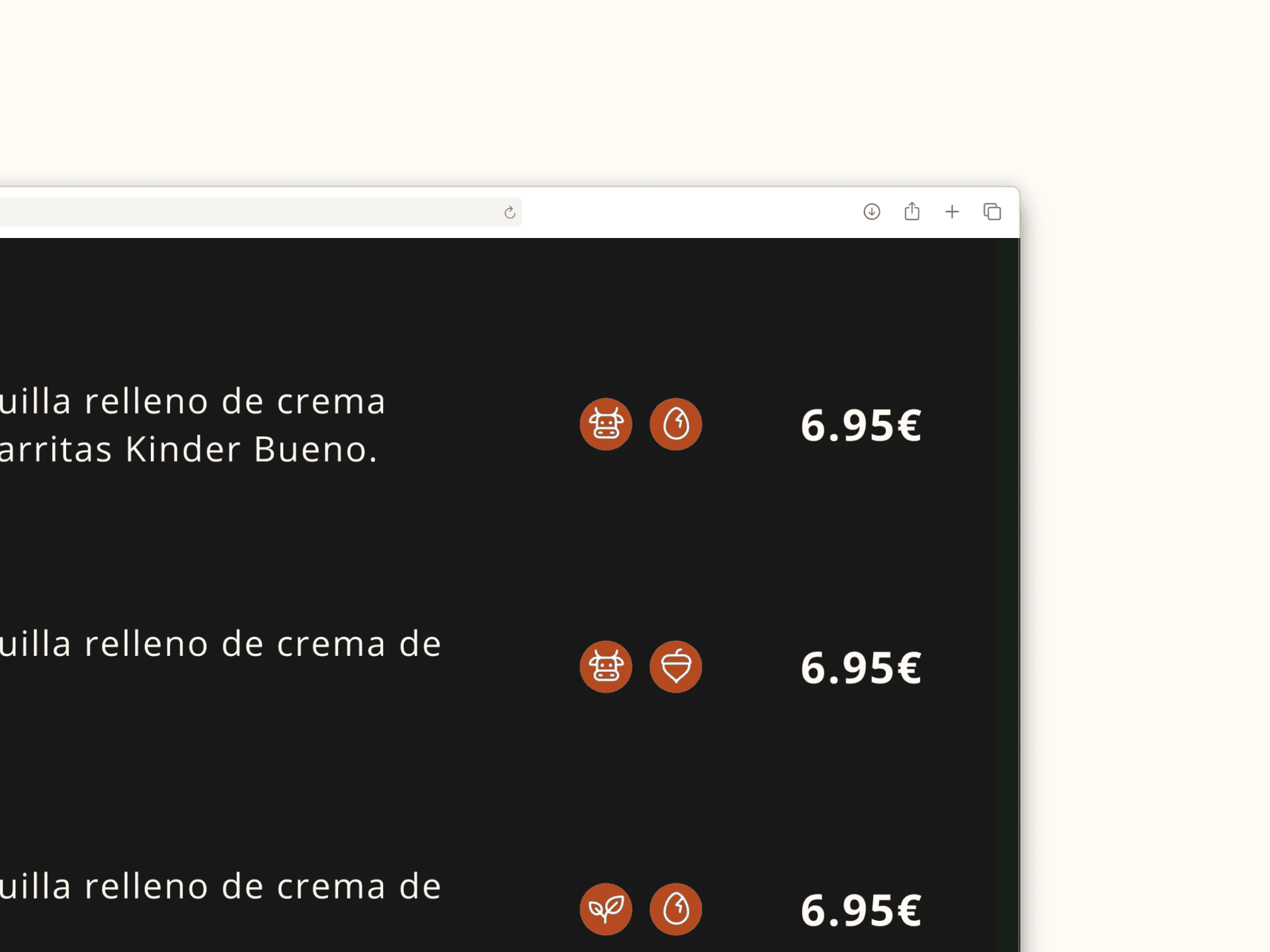
Number-based allergen indicators were replaced with visual icons and a clear, persistent legend.

WHY

Icons are immediate and universally understood. For something as important as allergen information, clarity isn't optional.

06

06.

MOODBOARD

The visual direction started with research: exploring how similar brands and establishments present themselves online, analysing layouts, colour choices and the overall feeling of spaces that share La Consentida's DNA.

The visual direction started with research: exploring how similar brands and establishments present themselves online, analysing layouts, colour choices and the overall feeling of spaces that share La Consentida's DNA.

The visual direction started with research: exploring how similar brands and establishments present themselves online, analysing layouts, colour choices and the overall feeling of spaces that share La Consentida's DNA.

07.

STRUCTURE & INTERACTION

STRUCTURE & INTERACTION

Before moving into designing, the structure was mapped out in low-fidelity wireframes. The focus was on layout, content hierarchy and navigation flow, establishing where everything lived before deciding how it looked.

Before moving into designing, the structure was mapped out in low-fidelity wireframes. The focus was on layout, content hierarchy and navigation flow, establishing where everything lived before deciding how it looked.

Before moving into designing, the structure was mapped out in low-fidelity wireframes. The focus was on layout, content hierarchy and navigation flow, establishing where everything lived before deciding how it looked.

08.

VISUAL IDENTITY

A warm, grounded aesthetic.

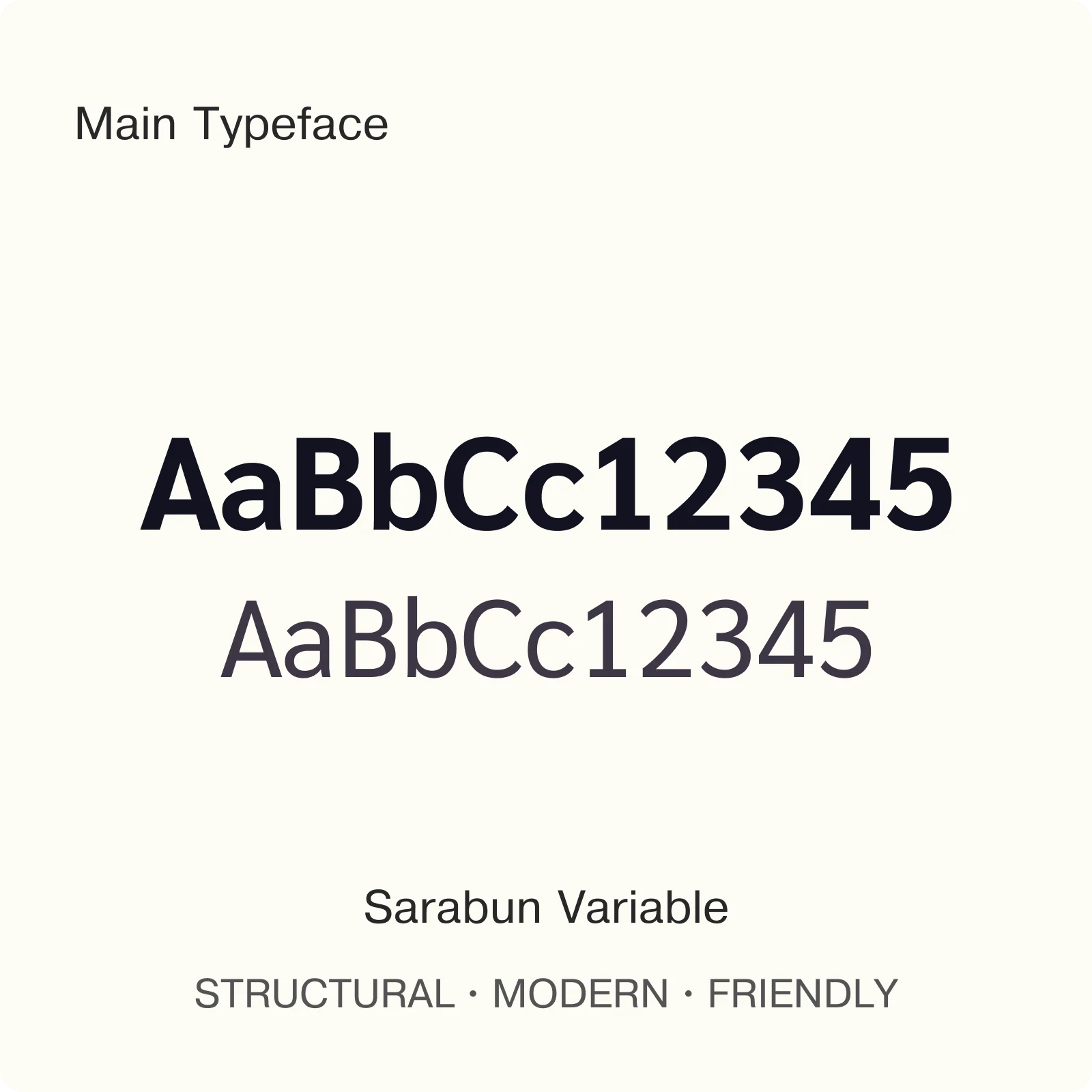
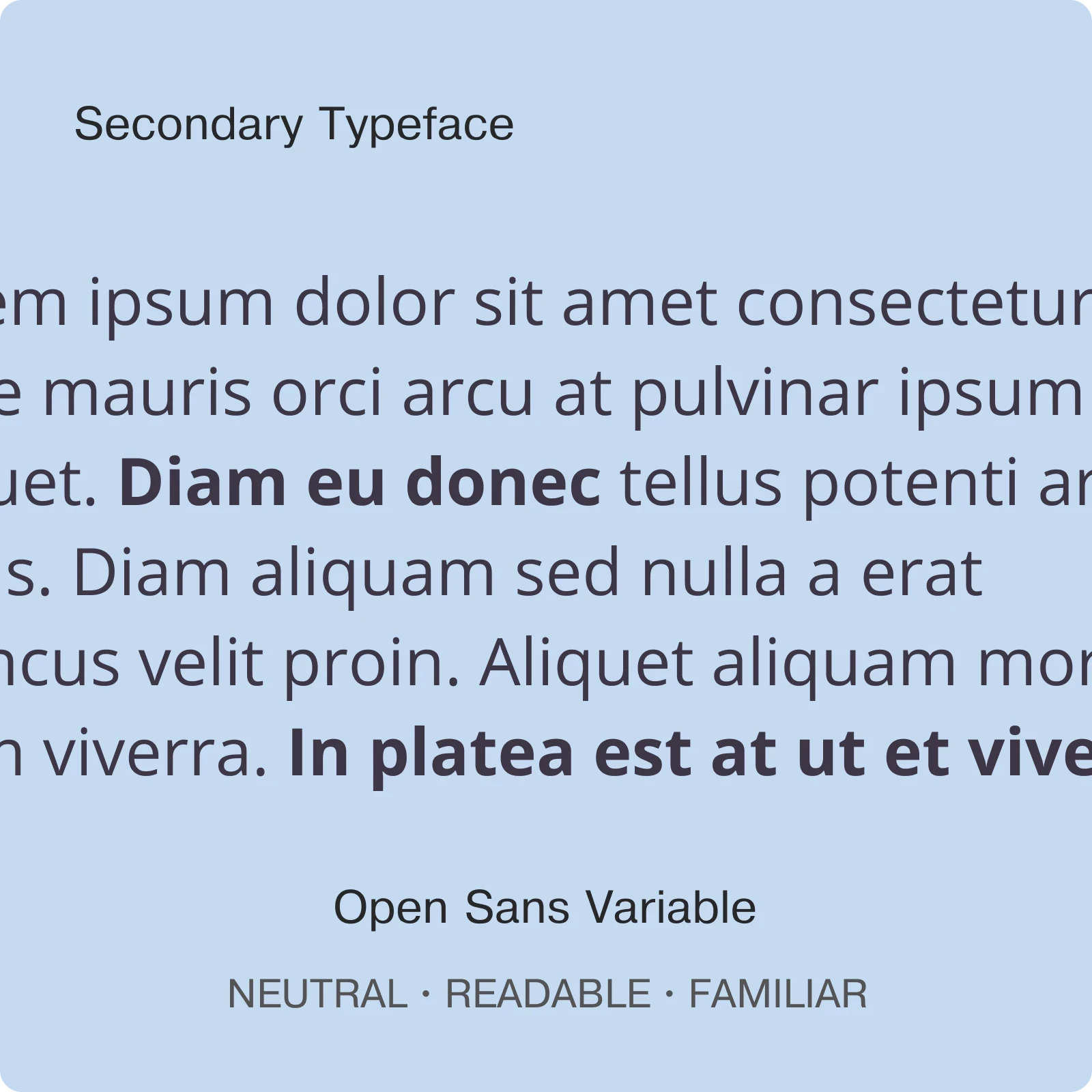
The visual direction was drawn from the brand itself, a space that feels lived-in, warm and carefully curated. Dark greens and rich earth tones ground the palette, while cream and amber bring lightness and warmth. The typography pairs a strong display face with a clean, readable body font. Confident without being cold.

Forest

Primary - 60%

TRUST ∙ SOPHISTICATION

#151E17

The food menu was designed as an overlay to keep users anchored to the page.

A UI kit was built to ensure every element stayed consistent across the design: navigation, buttons, typefaces, imagery style, allergen icons, contact and info cards. A single source of truth that makes the design scalable and cohesive.

THE RESULT ☆ THE RESULT ☆ THE RESULT ☆

09.

THE IMPACT

Content is organised to mirror the brand and clearly communicate what the company does. A strong information hierarchy allows visitors to scan the page, understand it quickly, and access details as needed. The structure supports a smooth, intuitive browsing experience.

Usability

A dated, inconsistent website with broken links and hidden information makes it hard to trust the place behind it. The redesign gives La Consentida a polished, reliable presence that reflects the quality of the space.

Trust

The visual identity strikes a balance between sophistication and familiarity. Deep greens and earthy tones convey a premium feel while remaining approachable, reinforcing the sense of a space you want to spend time in.

Warmth

Before

After

10.

RESEARCH DOCUMENTATION

The full heuristic review including detailed observations, severity ratings and recommendations for each issue, is available to view below.

Want something like this for your project?

Let's chat

Whether you’re starting fresh or improving something existing, I’ll help turn it into a website or app that looks good, works well, and is easy to use.

Want something
like this for
your project?

Let's chat

Whether you’re starting fresh or improving something existing, I’ll help turn it into a website or app that looks good, works well, and is easy to use.

Want something
like this for
your project?

Let's chat

Whether you’re starting fresh or improving something existing, I’ll help turn it into a website or app that looks good, works well, and is easy to use.

Want something
like this for
your project?

Let's chat

Whether you’re starting fresh or improving something existing, I’ll help turn it into a website or app that looks good, works well, and is easy to use.

Want something
like this for
your project?

Let's chat

Whether you’re starting fresh or improving something existing, I’ll help turn it into a website or app that looks good, works well, and is easy to use.